
Photographs and maps have a lot in common in interesting ways. I love both of them dearly, have always loved them, and I want to talk about just one characteristic they share.
A map can't show the real world and all its detail in a 1:1 correspondence. It's impossible. If it could, it wouldn't be a map, it would be reality itself. Reality is of course far too complicated, fluid, and grand to be fully represented by a 2 dimensional static diagram. Instead, a map has to pare down the detail it shows about the world until it becomes simple enough to be useful; one of the most salient features of any map is what isn't there, along with the moment in time the map represents.
So the mapmaker must decide what to show and what to omit. He may have several criteria for the choices he makes, things like utility and elegance and history. He must make something that communicates beautifully without adding confusing clutter, because in including more or less than necessary, the map will begin to fall short of being the very best map of its kind.
Making a photograph is the same. The photographer isn't reproducing exact reality because that's impossible for a photograph. Instead, he interprets, decides what should be included and what should be omitted when he composes the picture. Timing the image can be as important as what's included. The photo itself serves a function, a varying combination of utility and beauty, which are both forms of communication, just as a map is a sort of communication.
How much to include, how much to omit, and when to freeze the moment are design choices for the mapmaker, and aesthetic choices for the photographer. Some of us want to include as much as we can while others attempt a spartan minimalism.
I strive to be a photographer who has a rather different approach from the mapmaker who made the map below: I want to omit as much as I can, and in saying less, communicate more.
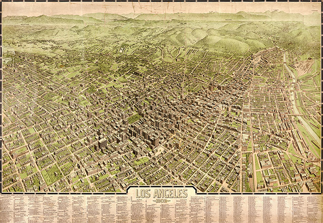
1909 Map of Los Angeles